Whenever you are building your online store, a good e-commerce website is a critical factor. It attracts potential customers for your business while providing users with an enjoyable experience. As your customers are satisfied with your product or services, it leads to increased sales of your online store.
We are Designing an e-commerce Store is quite different from building any regular website. E-Commerce stores happen to highlight the products and create the best buying experience for customers. Here are the best practices one can follow during eCommerce website design in 2022. These tips can take the online store and the business to the next level.

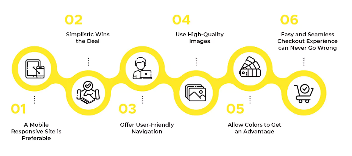
1. A Mobile Responsive Site is Preferable
While planning for an e-commerce website design, one must make it mobile-responsive. It becomes imperative for any e-commerce website builder to offer mobile responsive templates. It will display the content of the website consistently across any mobile device, from tablets to smartphones. It can provide a great deal and onsite experience with minimal design constraints.
As your website loads faster, mobile shopping customers will purchase quickly from your website or application. When you are building the e-commerce website, make sure that you view the website and all applications from diverse operating systems and devices
2. Simplistic Wins the Deal
You need to design your e-commerce website from a shopper’s point of view. A good eCommerce website would be easy to digest and easy to browse. It should make all the elements of the website purposeful. As you keep your website design simple and clean, you can focus on obtaining the sale while providing the customer with a positive buying experience.
A website with engaging content can help to maximize the visual appeal of the website.
3. Offer User-Friendly Navigation
Convenience is a reason why people opt for online shopping. If the e-commerce website cannot offer convenience to the users, it will result in shopping cart abandonment. A good website would help the customer find out exactly what they need. Effective and user-friendly navigation propels the customer to transit from browsing to purchasing.
Activating breadcrumbs on the product page would let your customers to numerous product categories and subcategories. Also, a display of the main navigation menu can let you have well-organized website sections.
4. Use High-Quality Images
High-quality images indeed help in increasing the conversion rate. Customers would like to see the product from every angle possible. If the website has a clean and actual, high-definition product photo, it helps build confidence and trust between the customer and the business.
Creating a slideshow on the product page would let your customer view the product from various angles. At the same time, one must remember to optimize the images for the web. Technically high-quality images may take a long time to load. Therefore taking the help of an e-commerce website builder to optimize and compress the images automatically would let the customer have an easy website viewing.
5. Allow Colors to Get an Advantage
Sometimes the color psychology principles can help your e-commerce website to increase conversion. Using proper imagery and color can both motivate and inspire a person to take action. In one of the studies, it was seen that websites showing too much red color, especially in CTA buttons increase the click-through rates by up to 34%.
Therefore you can choose a color that consistently goes with your brand. Pay attention to the accessibility guidelines while choosing the website color. To get the best result, you can follow the 60-30-10 design rule, where 60% goes for the dominant color, 30% for the second one, and 10% for the accent colors of the website
6. Easy and Seamless Checkout Experience can Never Go Wrong
A complicated checkout process with unexpected shipping costs can be the reason why customers abandon the shopping cart. If the checkout process of the website is easy and simple, it will be convenient for the customers to shop from your website. Make it a point to simplify the checkout process while stating the shipping fee, prices, and return policies.
Along with that, you need to provide numerous payment options to the customer. Enabling the one-click checkout option would let the customer have an enjoyable shopping experience.
If you can make the website easy for customers, they will be able to reach you fast. Hence it should be your priority to ensure the customers have an easy way to reach you. The addition of frequently asked questions or linking the websites to any social media profile would provide the customers with some ways to get in touch with you.
As you follow these tips to build your e-commerce website, it can help to increase the sales of your online store. Consumers generally abandon websites that function poorly. Hence you must begin your design by keeping your customers in mind. As you make the whole process easy for them it will enable you to sell your products easily.
If you’re looking for a website agency to help you turn your e-Commerce website into a machine gun raining sales, contact us right away. We are just a call away.


Leave a Reply